‘Tis the season for back to school shopping! Retailers are offering great deals this time of the year. My shopping list is comprised of classroom basics but I couldn’t resist browsing through the adorable goodies for the little guys. Here are a few of my favorites.
J Crew Factory-on sale and additional 25% off for card members online use code CARDPERK, students and teachers receive 15% off entire purchase in store with valid ID
She was the firm and small loving hand gripping my arm in the grocery store to deter me from poking the packaged meats (don’t ask, but if she wasn’t watching, I would go over and poke and smash the ground beef and steaks in the meat case. I never punctured the cellophane. I just liked to watch the indentations of my fingerprints slowly disappear in the meat. It’s weird, I know). She never truly scolded me, but her firm hand around my small wrist was enough punishment because I felt the embarrassment of getting caught and doing wrong.
She was the steady and ever working hands dicing onions and celery into the tiniest and uniformed pieces, picking cold Old Bay covered steamed crabs for crab cakes with a calm and unhurried patience. There never seemed to be a rush to finish, but her pace was constant and steady, and her movements deliberate.
She was the pointed index finger for emphasis. In times of frustration or emphasis, it was always the index finger, slightly bent with an extra shake if she was serious, but never the middle finger.
Her hands held kindness, patience, hard work, and restraint, but most of all love.
She was also the hand that mastered the art of correspondence. It’s a dying art, but she held on tight. Cards at birthdays– even for our blasted and ornery dog, articles cut out of newspapers and mailed. When my dad suffered a major injury, my grandmother sent him cards with notes of encouragement and comics every week. She was the the art of correspondence. To write a card, send an article, to sign “Love You XOXO” was her way of saying, “I’m thinking about you right now, and I took the time to sit down, write you a note, and mail it to you.” She got it.
Today, we send text messages, emails, snapchats, and post comments on facebook walls, but there is something a bit more personal and sincere, and definitely tangible to a handwritten note.
Handwritten Correspondence is much more lovely with gorgeous cards. Here are some of my favorites:
My good friend Jackie, another master of the handwritten note, often uses these clean and wonderful Kate Spade correspondence cards. They are simple and classic, and it doesn’t help that Jackie has beautiful handwriting!
source:Papyrus
Yes, my grandmother was many things, but everything that she was was inscribed with “love” and an “xoxo.”
We found our townhouse when we weren’t even seriously looking to move. We saw this house had popped up via foreclosure and when we went for a walk through we knew that the opportunity was too good to pass up. The house was in no means unlivable (compared to my old condo—which upon seeing it for the first time with my father I literally cried while he was like a child in a candy store). The house just needed a bit of TLC and some elbow grease, which we were more than willing to do.
It’s been a process, but we’ve chipped our way along most of the rooms in the house, trying to turn the damaged or lackluster spaces into something a bit more cozy and to our taste. Unfortunately, we’re not Rockefellers, so we’ve had to be very conscious of budgeting money for projects and choosing where to save and where to splurge just a wee bit.
The powder room in our house was a great candidate for a face lift. Here’s a shot before we moved in:
Not bad at all—the brown paint was a lot more intense than it seems in the photo, and the toilet, as in most vacant houses, had seen much better days. There was no mirror, towel bar, or lighting fixture—the bank had sold off these types of things in the entire house. These were some easy fixes.
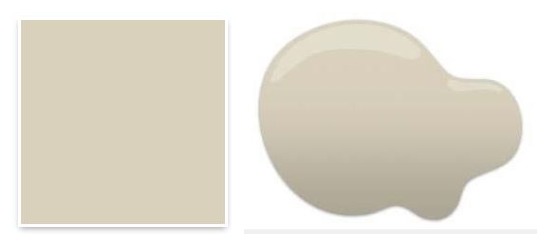
As the entire house had each room a different color (seriously– avocado green, navy blue, purple, both light and dark, orange, brown, sea foam green, and one in a peachy Venetian plaster faux finish), we chose to have it professionally painted one color before we moved in. With a two story foyer and crazy vaulted ceilings, it was worth it to us to pay to have the whole place painted a neutral color. We could then decide individual room paint colors later on and do this ourselves. We chose Wool Skein by Sherwin Williams- a great, warm neutral color.
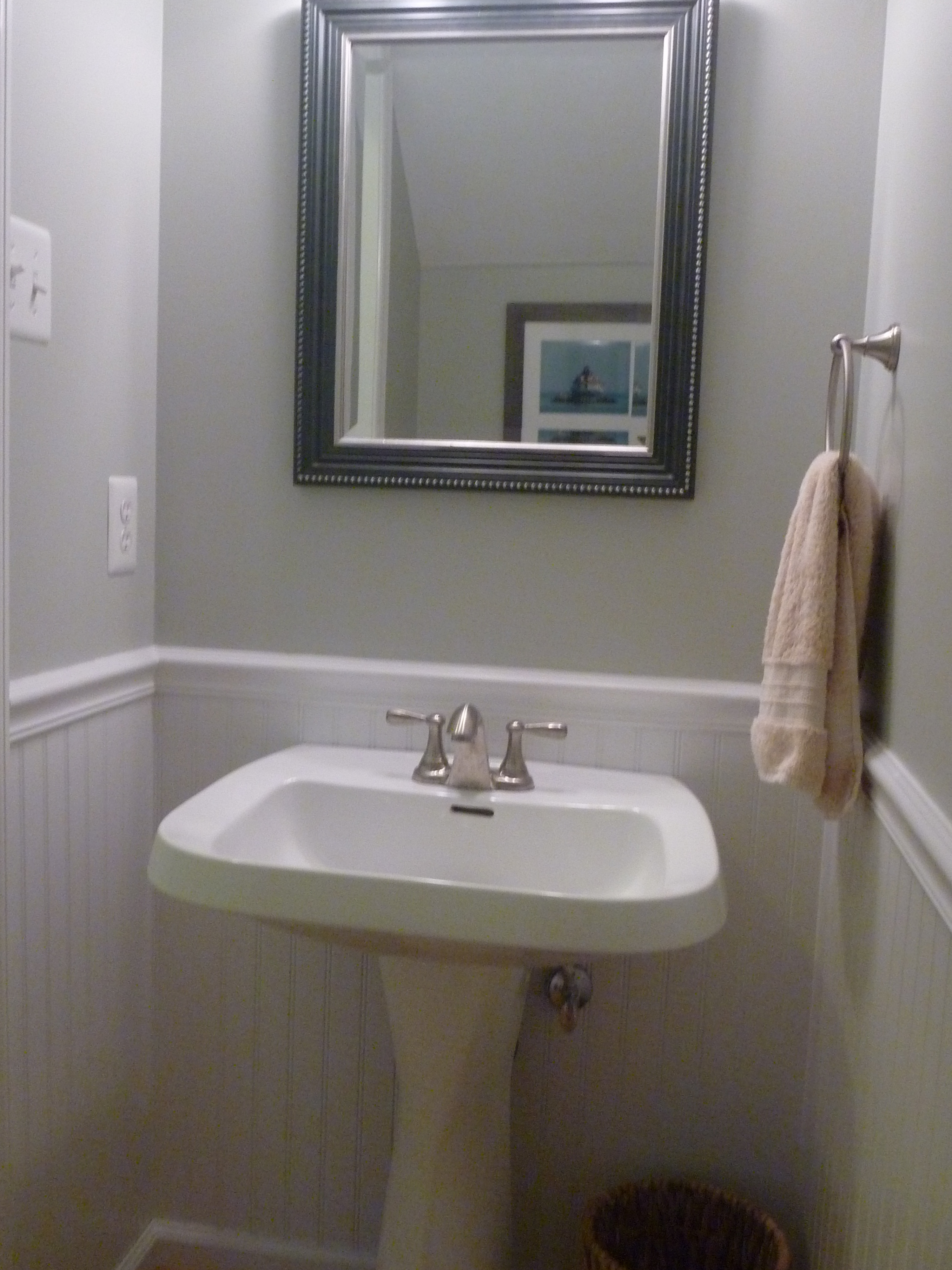
Here’s a shot after the neutral color went on as well as after we put in a new toilet (sorry it’s dark).
After adding a mirror, lighting fixture, towel bar, and toilet paper holder, the bathroom was fresh and functional. We left it this way for a little over a year and a half as we focused our attention on other spaces.
Since we decorated our living space on the first floor in hues of greens, blues, and creams, it was time to revisit the powder room. We wanted to coordinate the bathroom with the living space and newly constructed built in entertainment center.
It didn’t take much to further transform this bathroom. I love the look of beadboard in a bathroom, especially in a half bath where there may not be much character in the space. I think pairing blue or gray paint with white beadboard is a classic look (luckily my husband agrees) so our decision was easily made.
We put up the beadboard which was actually fairly easy to do. It is just a matter of cutting the sheet down to size, holding it against the wall, and using a nail gun to secure it in place—definitely a two person job.
Action shot of my hard worker :)
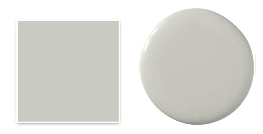
We then painted the walls from the top down to where the beadboard started. We came close to the top of the beadboard but were not concerned about being perfect as the chair rail would cover this anyway. The paint color is Aloof Gray by Sherwin Williams. It is a lovely color that I would certainly use again in the future.
After this dried, we installed the chair rail. We gave the chair rail and beadboard two coats of white paint that we had leftover from painting other trim in our house. After cutting/painting some base molding and then quarter round to match the wood floors, we were all set! This entire project took us a weekend to do.
Keeping with the sailing/Annapolis area theme of the basement, I found two photos, one of the Chesapeake Bay Bridge and another of the Thomas Point Shoal Lighthouse. It took a while to find frames that were a good match for the colors in the bathroom. I settled on these Threshold ones from Target:
I just needed a garbage pail and basket for toilet paper, and knew Homegoods was the place to find these. I settled on an antique looking wire basket with burlap lining for our toilet paper holder, and a natural basket for our garbage pail.
Here’s the final product:
I’m very happy with how this mini transformation came out. It was not expensive, took little time to do, and was a huge improvement from the dark cave-like space it used to be.
Have any of you given a mini makeover to your spaces lately?